

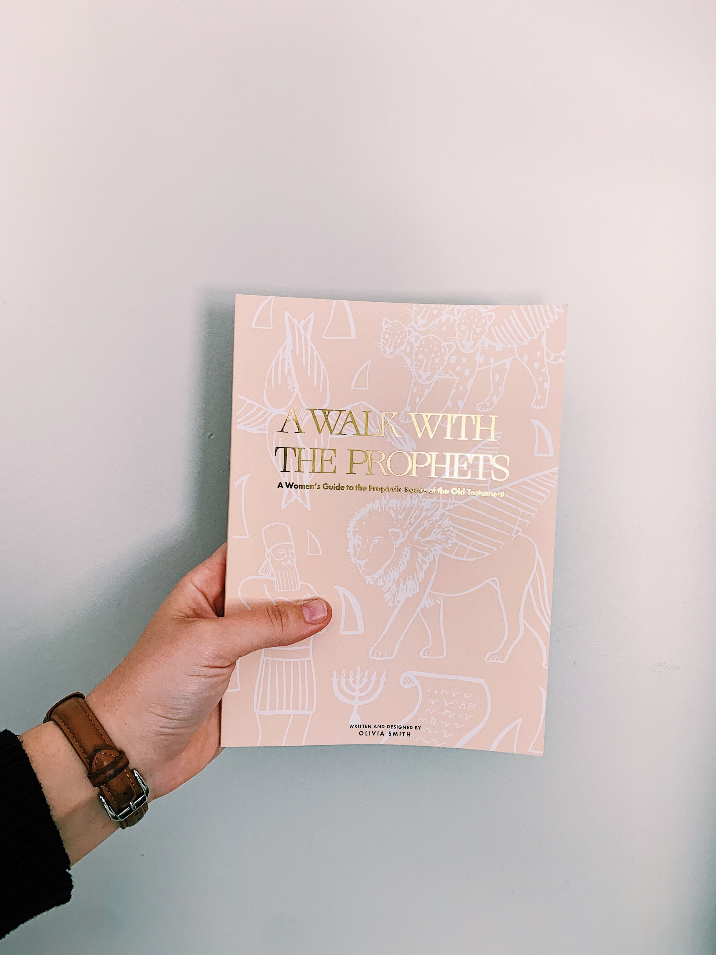
For my MFA thesis, I developed A Walk with the Prophets: A Woman’s Guide to the Old Testament Prophetic Books, a comprehensive resource designed to provide deeper insight into the prophetic books of the Old Testament. This book explores historical context, key themes, and theological significance, offering readers a clearer understanding of these sacred texts.
To enhance comprehension, the book features handcrafted visual elements—including timelines, illustrative maps, and original artwork—designed to present complex information in an engaging and accessible way. Below, you’ll find selected spreads and detailed breakdowns showcasing how this project integrates thoughtful design with in-depth research to support readers in their exploration of the prophetic genre.

A Walk With the Prophets: A Woman’s Guide to the Old Testament Prophetic Books

Informative Pages
To bridge the gap in understanding the role of prophets and the significance of prophetic literature, dedicated sections were written and designed specifically for women. These pages provide clear explanations to enhance comprehension and engagement with the material. Additionally, a peach-colored background was intentionally chosen to optimize readability, ensuring that dense information remains accessible and visually appealing.

Hebrew Literature
To enhance understanding of Hebrew literature, this section introduces women to foundational concepts, including parallelism—a key poetic structure frequently found in the prophetic books. This interactive component encourages readers to actively engage with the text by identifying and analyzing different types of parallelism. Additionally, each form of parallelism is represented by a distinct symbol, allowing readers to visualize its function and apply these symbols when annotating their Bibles or study notes.

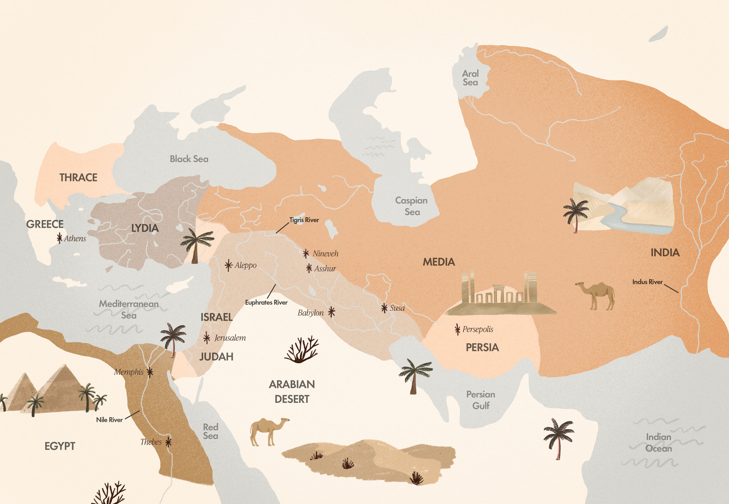
Historical & Cultural Gap
The historical and cultural gap was addressed by creating maps, timelines, and specific sections on the ancient empires of those days: Assyria, Babylon, and Medo-Persia. The timelines have warm colors and easy-to-read typefaces to utilize the research.


Want to learn more? You can view my entire thesis here.

If you’re inspired by the depth and intentionality of this project, imagine what we could create together. Whether you’re looking to develop a thoughtful, research-driven publication or a visually compelling planner, I’m passionate about crafting beauty-forward work that merges meaning.